Leaflet?

A global place for general discussion (Volvo, V3M or non-Volvo related topics).
Please introduce yourself here, your Volvo 300 hobby...
NO technical support, parts requests or car advertisements here
Post Reply
User avatar
MJ
*** V3M DONOR ***
Posts: 1933
Joined: 24 Feb 2005 10:32 pm
Location: Devon/Staffordshire, UK

Post by MJ » 16 Feb 2006 12:41 pm

How about this

Image

Like Dekays, but with the Volvo font and some extra text
Image

redline
*** V3M DONOR ***
Posts: 5432
Joined: 05 Oct 2004 10:18 am
Location: MILTON KEYNES , ENGLAND

Post by redline » 16 Feb 2006 02:29 pm

yeah I think that looks pretty cool MJ,
can you do me a favour
( coz I am an old fart and cant do all this clever computery crap lol)
can you just do it again but with the url in the middle and the friendly forum bit at the top just to see how it looks (leave the meets parts advice bit at the bottom though )
Image

User avatar
d3k4y0
*** V3M DONOR ***
Posts: 1033
Joined: 24 Jun 2005 03:05 pm
Location: St Helens

Post by d3k4y0 » 16 Feb 2006 03:04 pm

here's the one i was doing last night

I was being an eejit and trying to export as CMYK so it was spazzing up in firfox
Image

Click for the fullsize version.

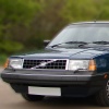
I don't like the one with the saloon on for 3 reasons
1) it's got backwards writing on it
2) It's not symetrical
3) it's being pointlessly over complicated, should we go out of our way to insure that the front projection is of a 3 door?
I've got a 3 door! i don't want to be associated with this card because it's not depicting my particular model!
Oh and it's a wrong hand drive version!
AND it's a Mk2!
With the fronts only you can't tell if one isn't a saloon
Image

User avatar
MJ
*** V3M DONOR ***
Posts: 1933
Joined: 24 Feb 2005 10:32 pm
Location: Devon/Staffordshire, UK

Post by MJ » 16 Feb 2006 03:12 pm

I like the : : between the text, but personally I think the rears are better, as otherwise you've got three shots of the front. It also has Mk2 and 3, your last is just 2, and almost all the ones on here are Mk3
Image

User avatar
SteveP
*** V3M DONOR ***
Posts: 7943
Joined: 21 Sep 2004 12:45 pm
Location: Coventry, UK

Post by SteveP » 16 Feb 2006 03:13 pm

I agree I think the V3M URL needs to be in the centre of the card - I also don't really think its necessary to have 'dedicated to the 340 and 360' because the images and URL give that away anyway.

Plus why does the font look so bold on MJ's version?

Heres what I reckon anyway:

Image
1989 - Volvo 360 GLT
1985 - Volvo 360 GLS
2008 - Volvo S60 SE Lux

User avatar
MJ
*** V3M DONOR ***
Posts: 1933
Joined: 24 Feb 2005 10:32 pm
Location: Devon/Staffordshire, UK

Post by MJ » 16 Feb 2006 03:15 pm

I didn't think it looked right. I may have left bold on in Paint Shop Pro...
Image

User avatar
SteveP
*** V3M DONOR ***
Posts: 7943
Joined: 21 Sep 2004 12:45 pm
Location: Coventry, UK

Post by SteveP » 16 Feb 2006 03:17 pm

We're being too picky again (remember T-shirts!?) - who gives a damn as long as they look good and give the potential V3M-er the information required, ie. the URL and what we're about.

All of the previous designs have done this. I'm not too bothered about the design too much, they all do their job - does it really matter if the images don't have a MK3 300 on? I didn't even notice til I looked closely.

I think we need to reach a decision ASAP or this will go on forever :lol:
1989 - Volvo 360 GLT
1985 - Volvo 360 GLS
2008 - Volvo S60 SE Lux

User avatar
d3k4y0
*** V3M DONOR ***
Posts: 1033
Joined: 24 Jun 2005 03:05 pm
Location: St Helens

Post by d3k4y0 » 16 Feb 2006 03:24 pm

SteveP wrote:
Plus why does the font look so bold on MJ's version?
Probably a very simple explanation for that :P

The makes and models are totally irrelavant, somebody is not going to discard it purely because it's not their specific model.
The final version of it will be so small anyway that you would need to actually really inspect it to tell that it's a LHD Mk2 5door 340.
Does that mean that we don't accept members with any other type of car?
Image

redline
*** V3M DONOR ***
Posts: 5432
Joined: 05 Oct 2004 10:18 am
Location: MILTON KEYNES , ENGLAND

Post by redline » 16 Feb 2006 03:31 pm

Personally I think we have a winner
the top paragraph is a nice friendly introduction


Image


as most of us agree it dosent matter what 300 it is as long as its a 300 ,

no bias between saloon and hatch (or even van for that matter )

its easy on the eye ( bit like me )

and gets the message across well .(which is the whole point of it isnt it)


what we are , where to find us and what we do, job done
Last edited by redline on 16 Feb 2006 03:38 pm, edited 1 time in total.
Image

User avatar
SteveP
*** V3M DONOR ***
Posts: 7943
Joined: 21 Sep 2004 12:45 pm
Location: Coventry, UK

Post by SteveP » 16 Feb 2006 03:36 pm

Agreed... I'll go with that
1989 - Volvo 360 GLT
1985 - Volvo 360 GLS
2008 - Volvo S60 SE Lux

redline
*** V3M DONOR ***
Posts: 5432
Joined: 05 Oct 2004 10:18 am
Location: MILTON KEYNES , ENGLAND

Post by redline » 16 Feb 2006 03:39 pm

God Gavin , what have you started , you have created a monster ,
seriously I think it could be a good basis for the shirt,
just use the pic and the url
Image

User avatar
SteveP
*** V3M DONOR ***
Posts: 7943
Joined: 21 Sep 2004 12:45 pm
Location: Coventry, UK

Post by SteveP » 16 Feb 2006 03:41 pm

Yeah.. very true, I quite like the simplicity.. would prefer the URL to be on the back of a shirt though. Although not that I'd actually end up wearing one :lol:
1989 - Volvo 360 GLT
1985 - Volvo 360 GLS
2008 - Volvo S60 SE Lux

User avatar
d3k4y0
*** V3M DONOR ***
Posts: 1033
Joined: 24 Jun 2005 03:05 pm
Location: St Helens

Post by d3k4y0 » 16 Feb 2006 03:42 pm

redline wrote:I think It could be a good basis for the shirt, just use the pic and the url
I don't want a MK2 on my shirt!
sm31

the more i look at it the more I don't like the change in fonts between top and bottom...

OCR (top) or Arial (bottom) all the way through
Image

User avatar
SteveP
*** V3M DONOR ***
Posts: 7943
Joined: 21 Sep 2004 12:45 pm
Location: Coventry, UK

Post by SteveP » 16 Feb 2006 03:46 pm

I vote for OCR... looks more techincal in line with the rest of the image
1989 - Volvo 360 GLT
1985 - Volvo 360 GLS
2008 - Volvo S60 SE Lux

User avatar
d3k4y0
*** V3M DONOR ***
Posts: 1033
Joined: 24 Jun 2005 03:05 pm
Location: St Helens

Post by d3k4y0 » 16 Feb 2006 03:57 pm

SteveP wrote:I vote for OCR... looks more techincal in line with the rest of the image
agreed and changed

Image
click for big again

edit: also I've just noticed that the Mk2 blueprint is the smoothest of them all anyway, using the Mk3 hatch one looks a bit ragged at good resolutions

I've got the PSD file of this if we want to do it through vistaprint
Image

Post Reply